PROBLEM
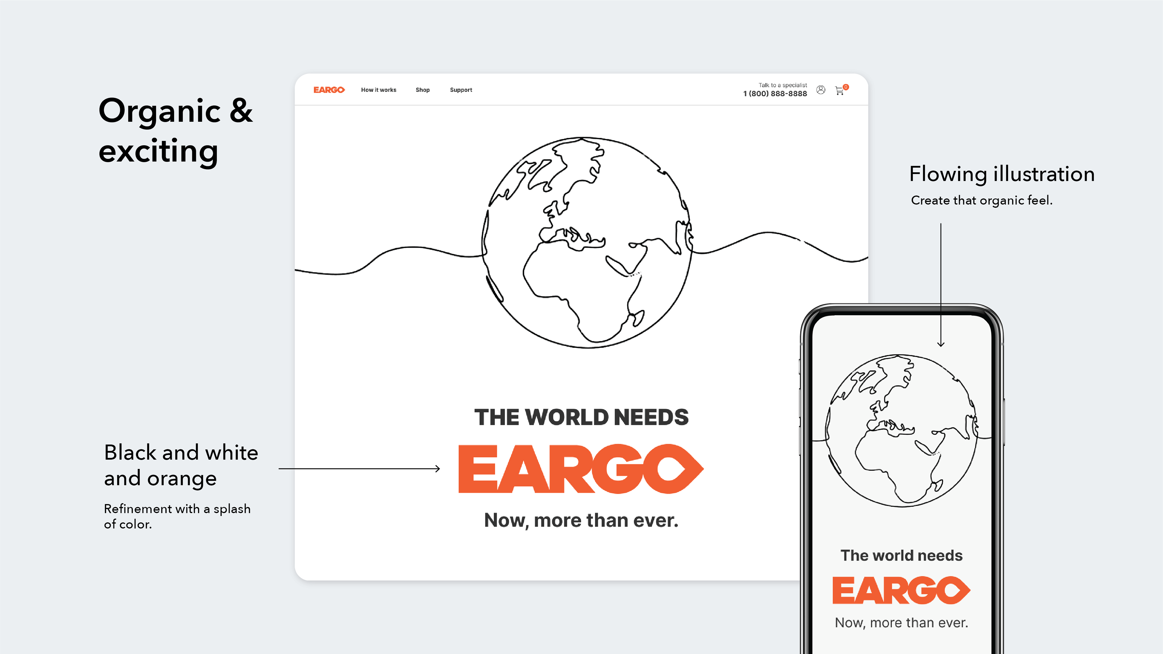
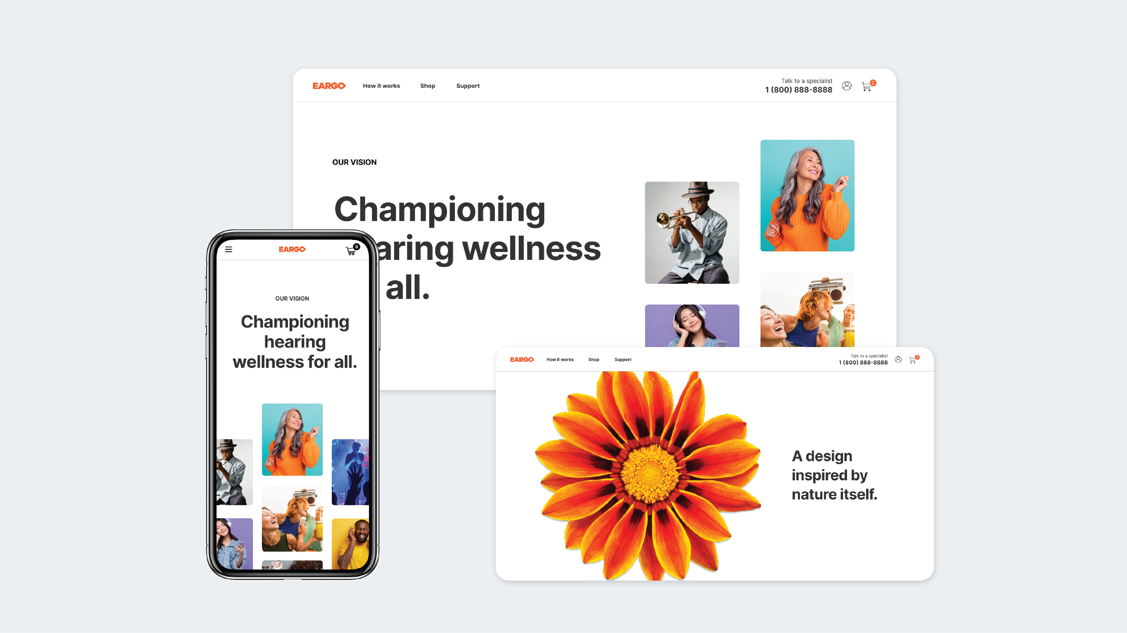
Before I designed the Eargo Brand page, the company had no single location to explain the mission and vision of Eargo - no web presence to concisely put forth their reason to exist. At that point, the company was also in need of a major brand pivot to some new styling. The previous look had become too blocky, out-dated, visually heavy, and over-reliant on orange. It was orange everything.
SOLUTION
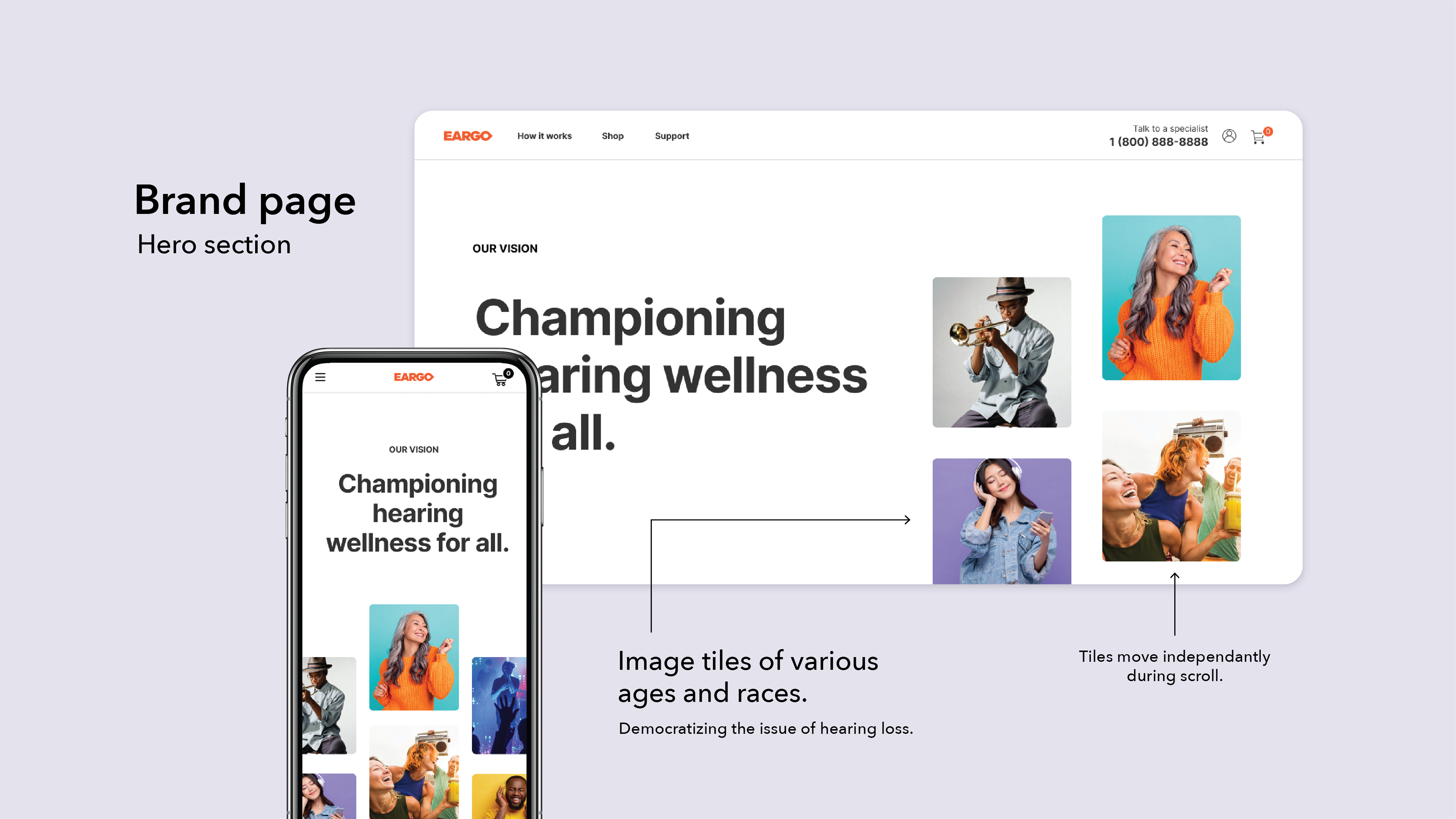
In preparation for the challenge of creating a new brand style while simultaneously applying that style to a page that didn't exist yet, I did some audits of About, Mission, and Vision pages of other organizations. I specifically looked for businesses I felt told a story well through scroll, or what's sometimes called "scrolly-telling."
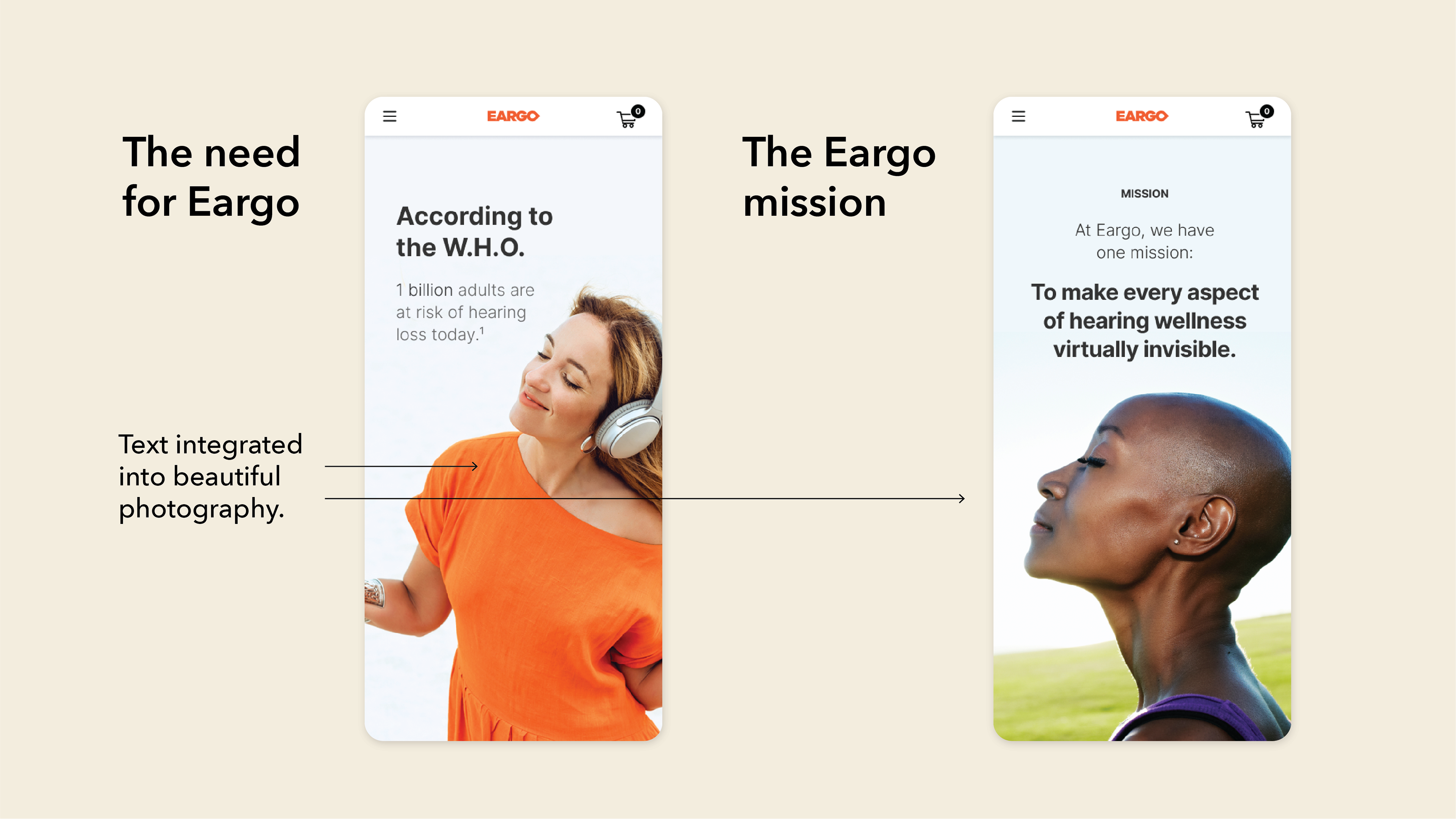
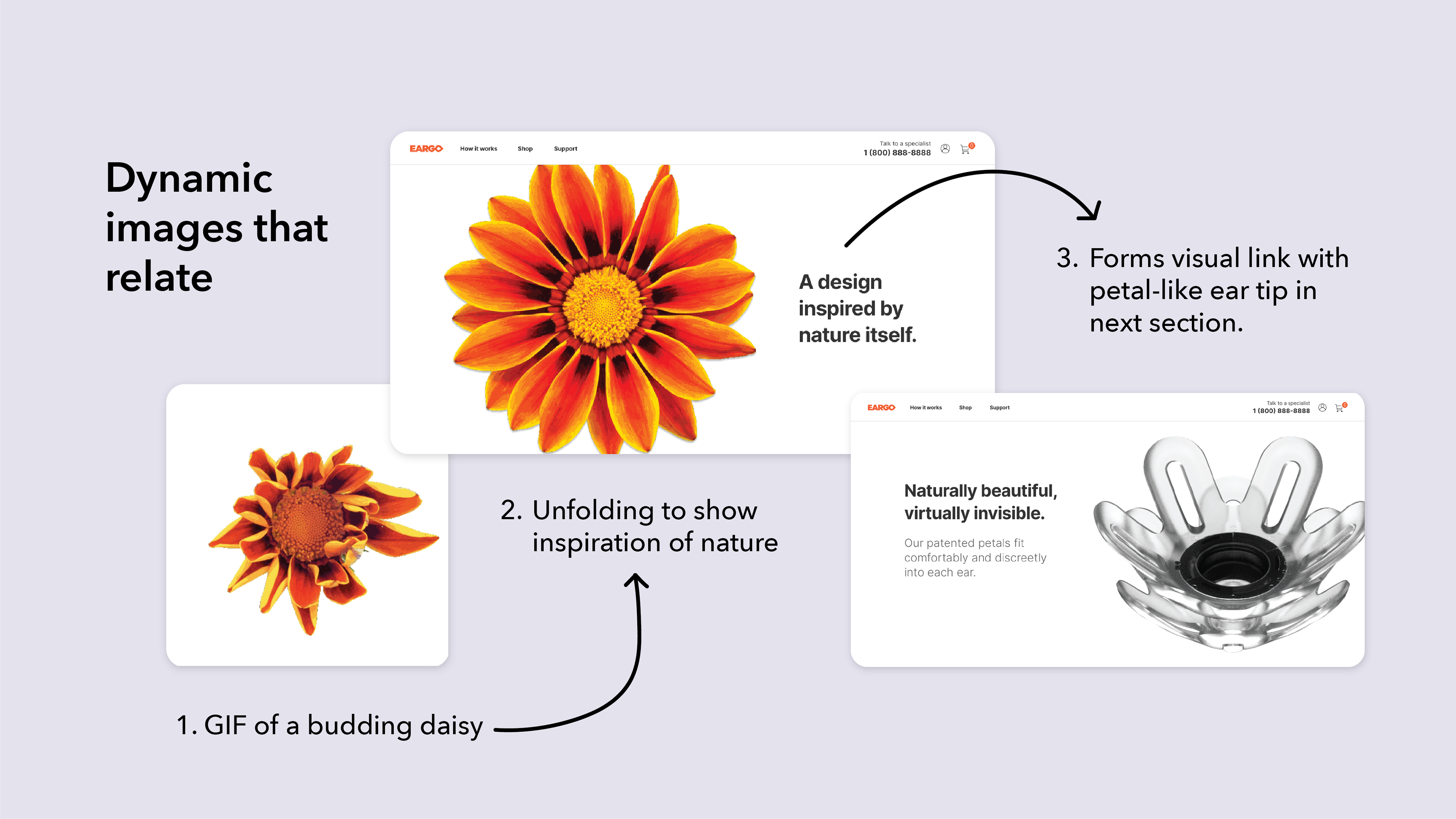
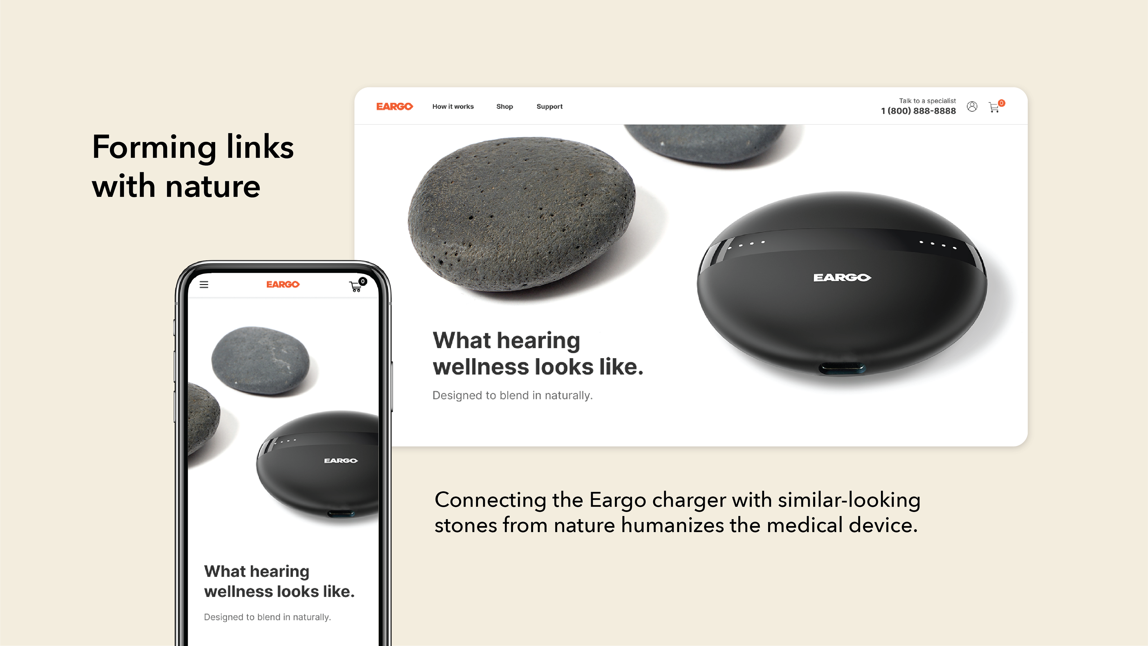
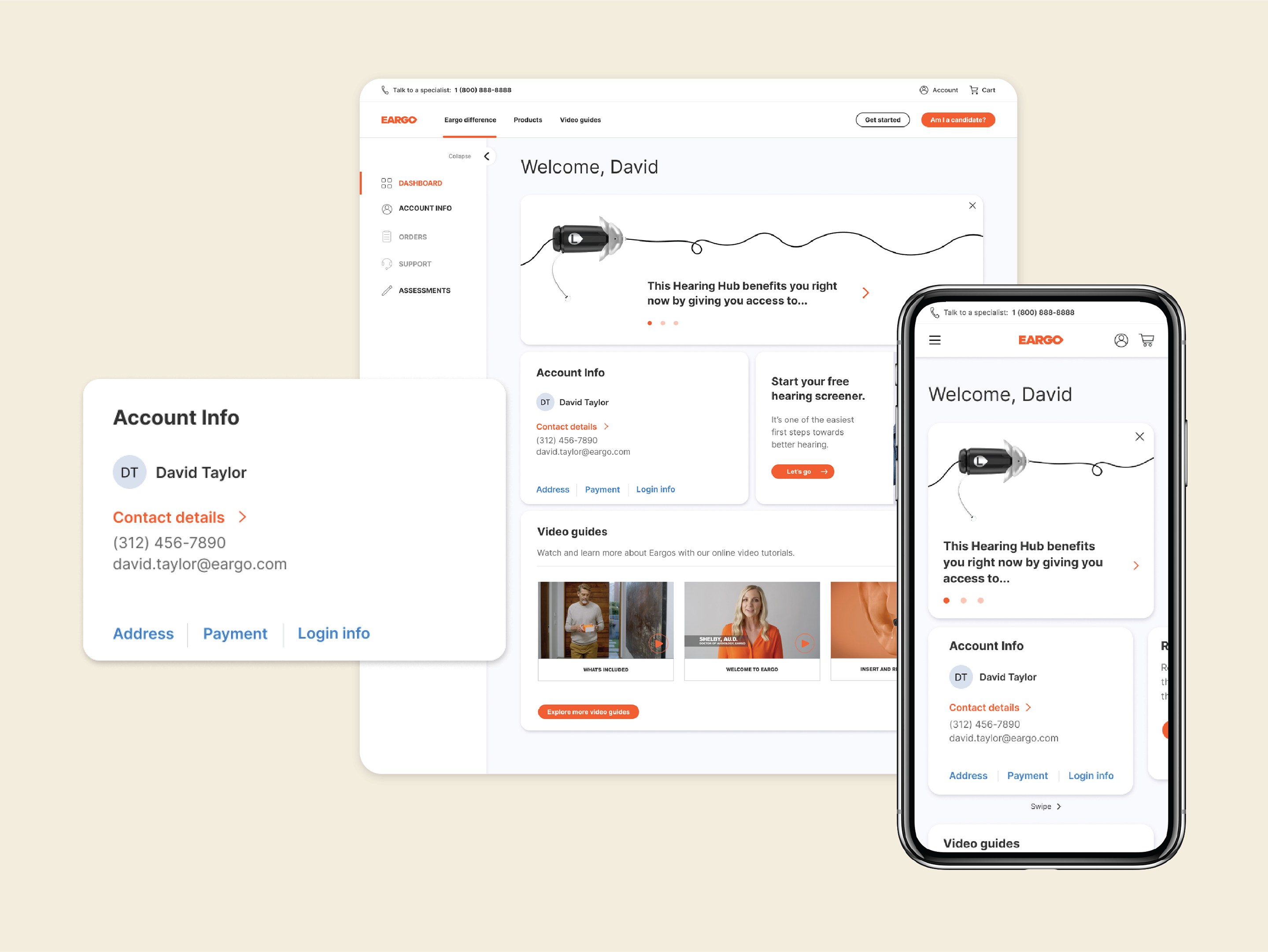
With direction from Eargo's CMO, we landed on a primary color palette of black, white, and orange. However, the secondary palette was left up to me. I chose cream, lavender gray, and an off-white tone dubbed "white smoke;" all very subtle background colors. Brighter colors were then reserved for backgrounds in lifestyle photography. The rounded corners of tiles and buttons help to soften and humanize the brand and build trust as a medical company. Links to nature and organic-feeling illustrations throughout help the brand seem less sterile and more connectable.
The page was a HUGE hit. Eargo's CMO latched onto the designs right away and used them as an example of what the rest of the brand overhaul should look like. My design decisions informed foundational elements of the new brand style guide and those elements were inducted into the design team's Figma library. The page has since become one of the most heavily-trafficked areas of Eargo's site and has informed all marketing touch points, from emails to landing pages and social media.