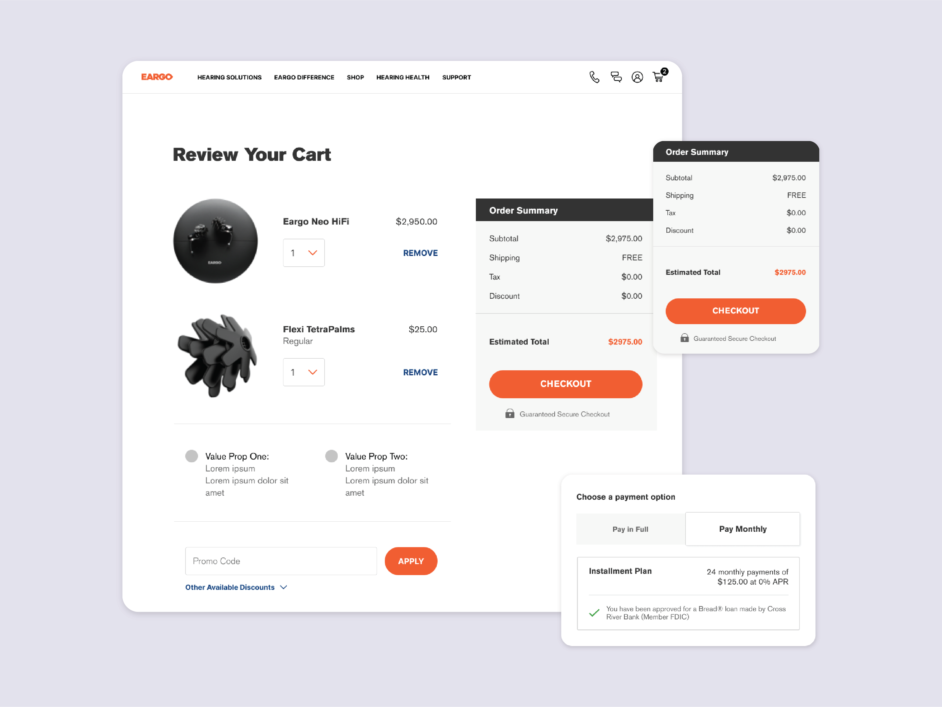
PROBLEM
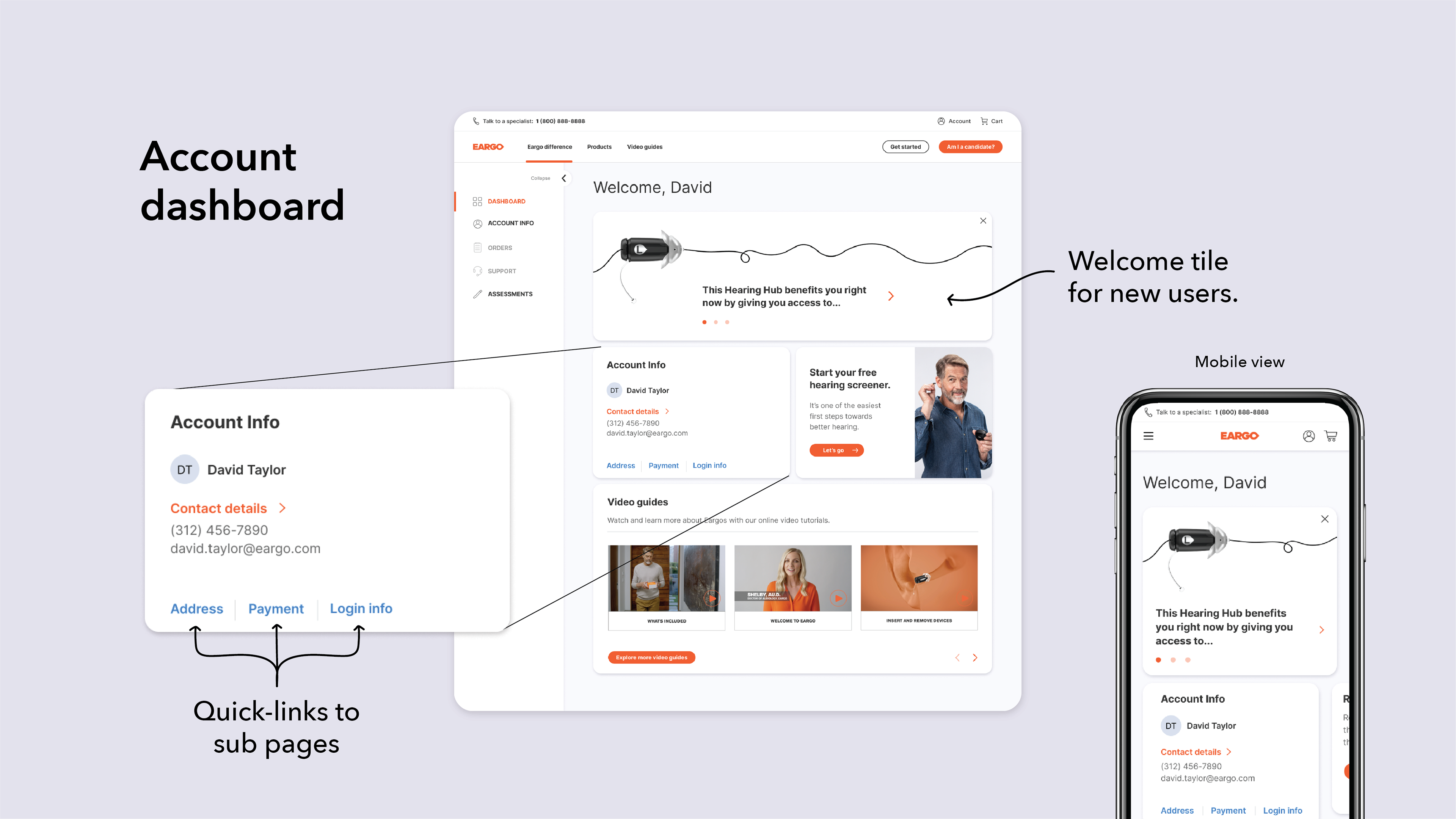
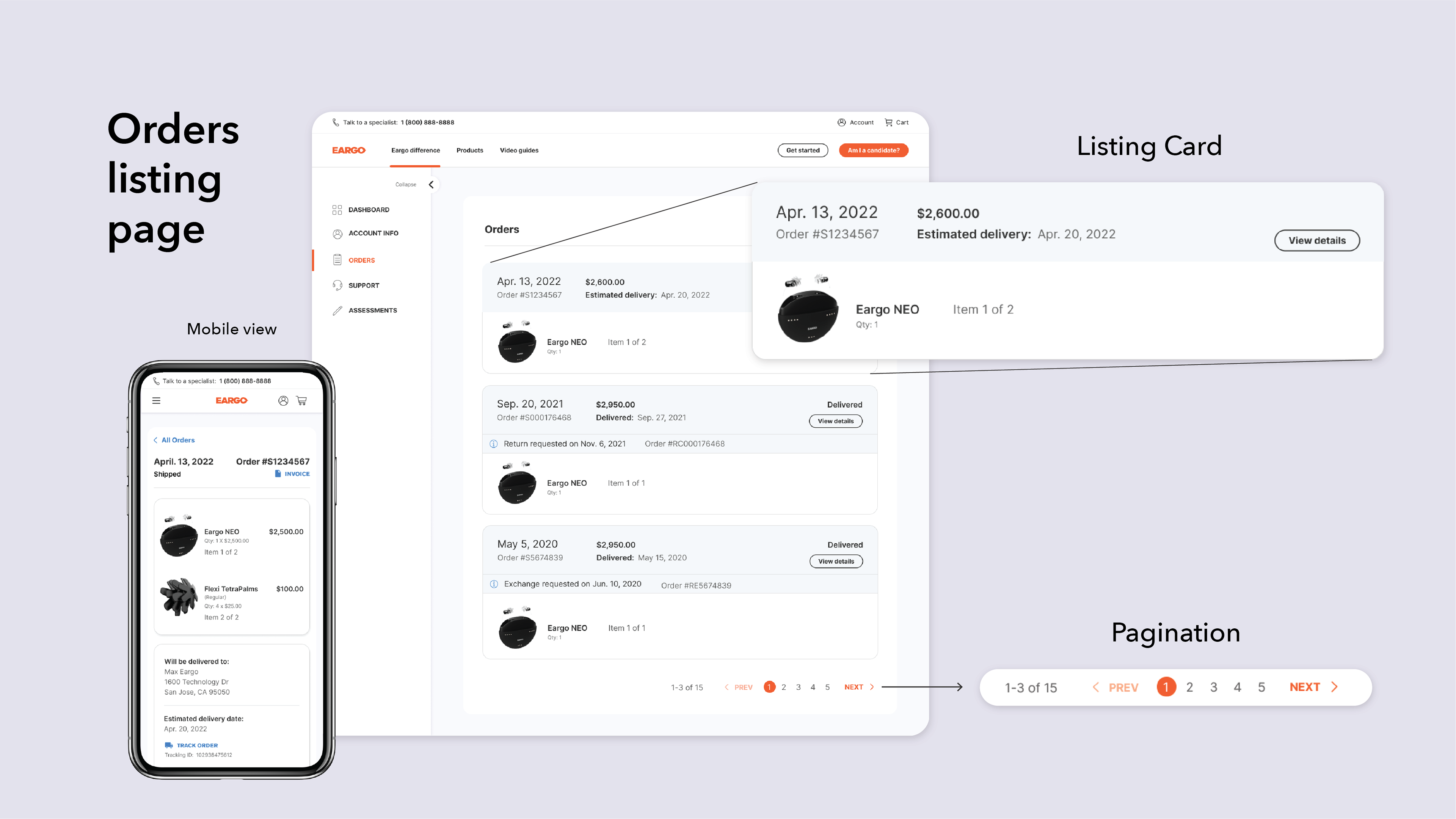
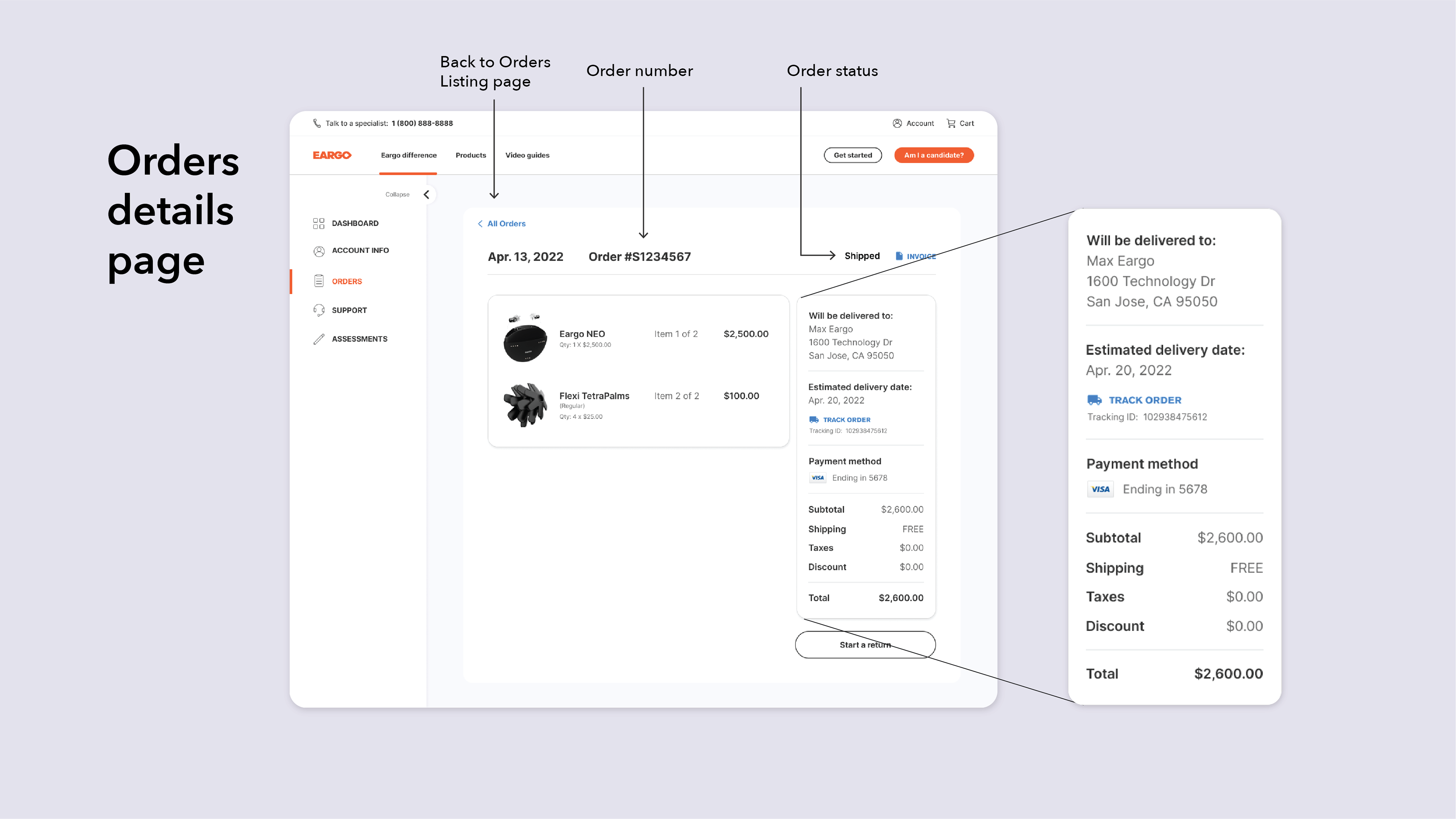
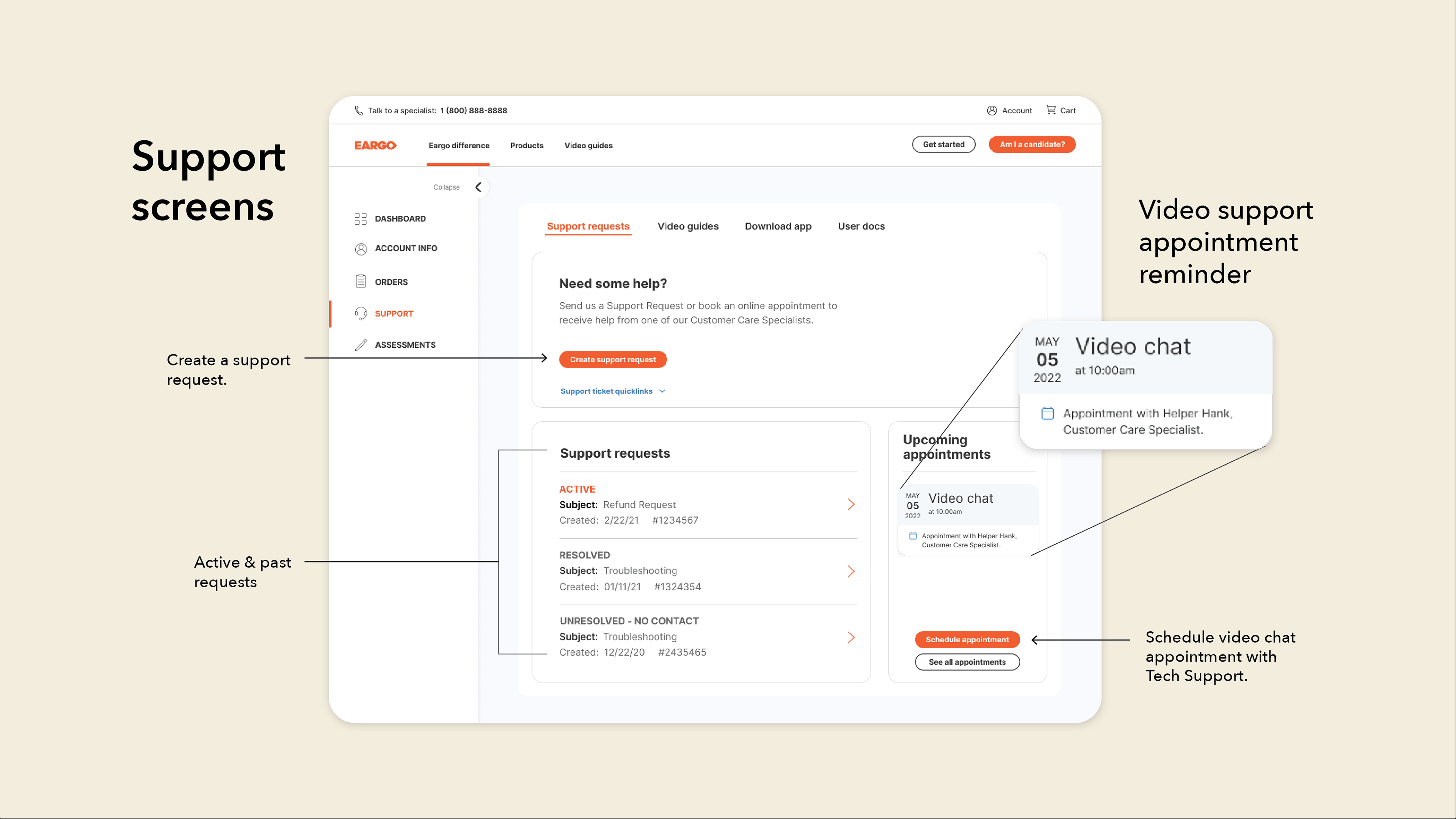
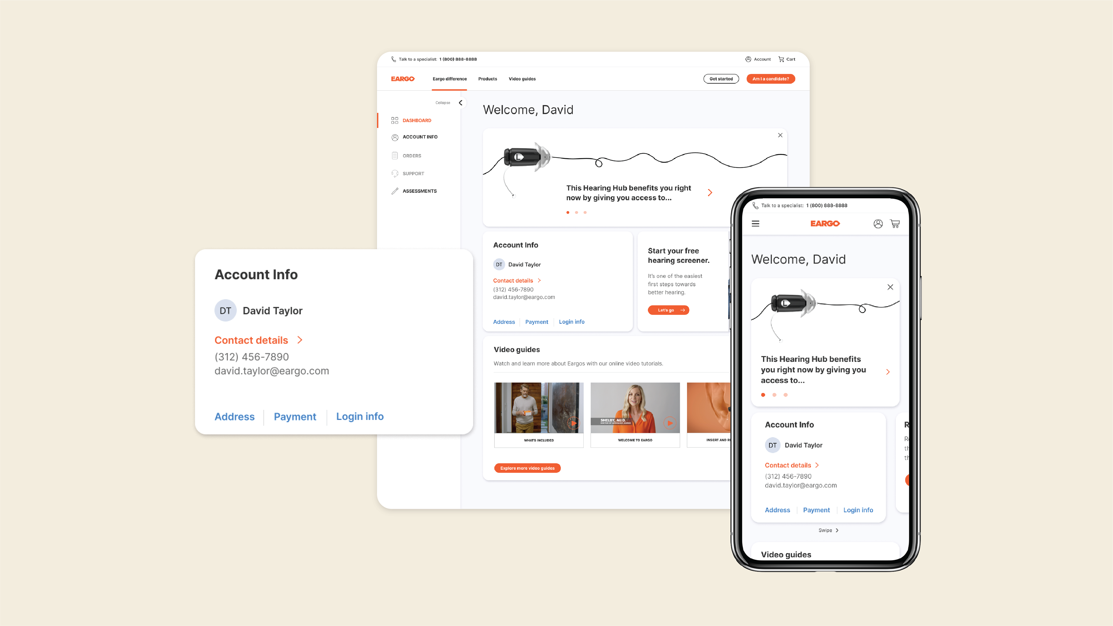
Prior to the work I did on Eargo's account screens, user experience was pretty abysmal. The account portal had no dashboard to reach things from a clear central location. The Orders screens had no listing page, which meant clicking into each individual order if you wanted to see any information on it. Related orders were also strangely nested inside of each other, which was confusing for users. There was no feature for scheduling tech support appointments and the branding needed to be updated to match the colors, fonts, and buttons of the evolving site.
SOLUTION
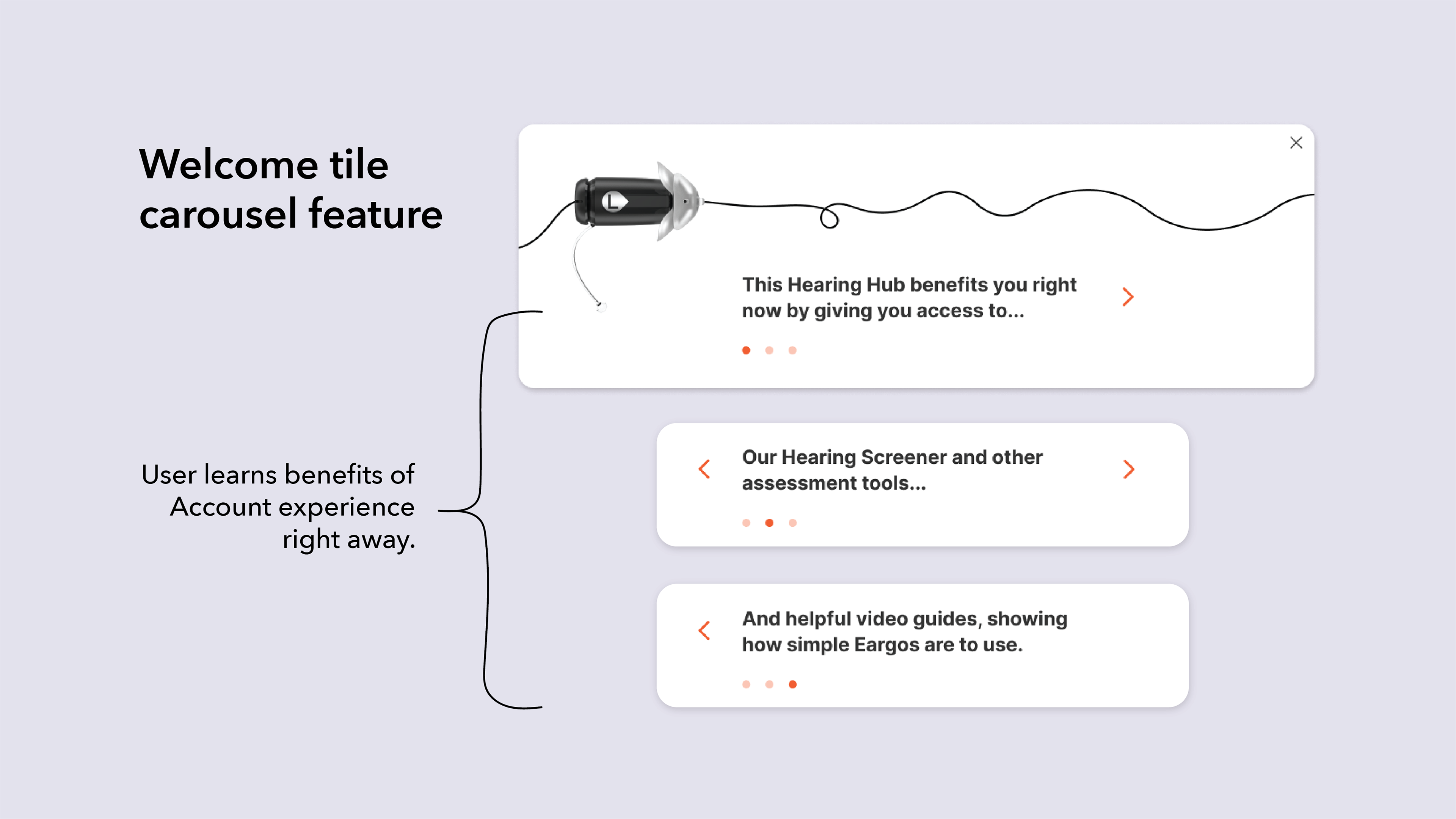
In preparation for the project, I audited a number of different user accounts and dashboards. I landed on a tile layout for the dashboard, including a Welcome tile with built-in carousel and smart tiles that could tie into the company's analytics. The Welcome tile was a way to immediately communicate to the user the benefits of interacting with the available account features.
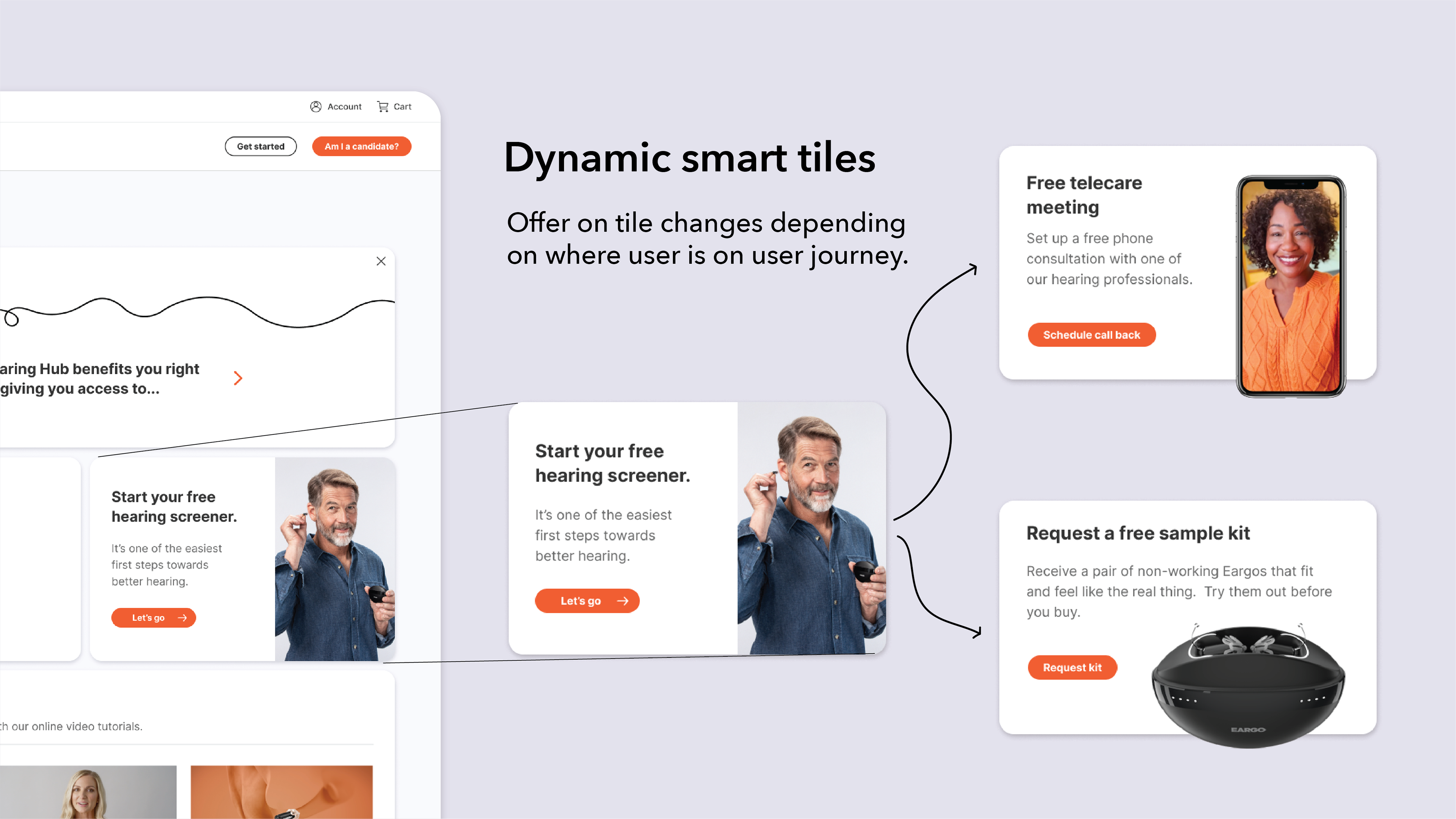
The smart tiles were meant to tie into the site's analytics and make changes to the tiles based on a user's place in the user journey. For example, on first visit to the dashboard, a user might be shown the option to take a hearing screener. But if analytics show the user already has, then the tile would instead offer them a free consultation with a hearing professional.
The improvements on the Eargo account experience are still in development but has received positive praise from all stakeholders, including Eargo executives.